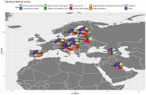
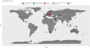
In this post, we would go through the steps to plot pie charts on a world map, just like the one below.

This image probably scared you as much as it did to me when I realized I need to create something the same as this. “How am I supposed to do this thing when I’m not even good in R programming, in fact, a newbie?” You’re probably asking this to yourself right now, or you already did. I feel you, but I got you. I struggled so much on doing my first map plot, that’s why I’ll be sharing to you the step-by-step ways on how to do it using ggplot, to save you from all the google searches and trial-and-error.
With that, we will be answering a specific question using real-world data as we go along these steps.
“Are there differences in the distribution of causes of death per country?”
I managed to acquire a decent data about death causes in the world per country from kaggle.com which will be used in our illustrations and simulations.
Prepare the Data
The first thing that we need to do is to make sure that our data is complete, that we have what we need prior to plotting. In this case, we need the data for the death causes per country and, the coordinates of each country. Then, we will load it to our work environment as below.
| rm(list=ls()) | |
| library(memisc) | |
| library(assertthat) | |
| library(sqldf) | |
| library(magrittr) | |
| library(dplyr) | |
| library(reshape2) | |
| library(ggplot2) | |
| library(oz) | |
| library(scatterpie) | |
| library(rgdal) | |
| library(maptools) | |
| # Helper functions | |
| data_prep <- function(csv_name) { | |
| import <- read.csv(paste0("./Data/", csv_name), stringsAsFactors = F) | |
| names(import) <- tolower(names(import)) | |
| import <- import[, c("country.or.area", | |
| "sex", | |
| "age", | |
| "cause.of.death..who.", | |
| "record.type", | |
| "value")] | |
| names(import) <- c("country", "sex", "age", "death_cause", "record_type", "value") | |
| assert_that(length(names(import)) == 6) | |
| return(import) | |
| } | |
| ############### | |
| perform_groupby <- function(data, sex_filter, record_filter) { | |
| #data <- import | |
| #sex_filter <- "Female" | |
| #record_filter <- "Data tabulated by year of occurrence" | |
| final_data <- data %>% | |
| filter (!sex == sex_filter, record_type == record_filter) %>% | |
| group_by(country, death_cause) %>% | |
| summarise(count = sum(value)) %>% | |
| ungroup %>% | |
| as.data.frame() | |
| return(final_data) | |
| } | |
| pivot_by_country <- function(data) { | |
| s1 = melt(data, id = c("country", "death_cause"), measure.vars = "count") | |
| s2 = dcast(s1, country ~ death_cause, sum) | |
| s2$Total = rowSums(s2[,2:NCOL(s2)]) | |
| return(s2) | |
| } | |
| # Main Logic | |
| death_data <- data_prep("death2014.csv") | |
| grouped_data <- perform_groupby(death_data, "", "Data tabulated by year of occurrence") # Data tabulated by year of occurrence # Data tabulated by year of registration | |
| grouped_data$death_cause <- gsub("*, ICD10", "", grouped_data$death_cause) | |
| grouped_data$death_cause <- gsub("Symptoms, signs and abnormal clinical and laboratory findings, not elsewhere classified", "Abnormal clinical and lab findings", grouped_data$death_cause) | |
| # Top 10 leading cause overall | |
| overall_data <- grouped_data %>% | |
| group_by(death_cause) %>% | |
| summarise(totalcount = sum(count)) %>% | |
| ungroup %>% | |
| as.data.frame() | |
| overall_data <- overall_data[order(-overall_data$totalcount), ] | |
| top_ten_causes <- overall_data[2:10, "death_cause"] | |
| top_ten_causes <- gsub("*, ICD10", "", top_ten_causes) | |
| grouped_data$death_cause2 <- grouped_data$death_cause | |
| grouped_data1 <- grouped_data %>% | |
| filter (death_cause %in% top_ten_causes) | |
| grouped_data2 <- grouped_data %>% | |
| filter (!death_cause %in% c(top_ten_causes, "All causes")) | |
| grouped_data2$death_cause2 <- "Others" | |
| grouped_data <- rbind(grouped_data1[, c(1,3,4)], grouped_data2[, c(1,3,4)]) | |
| names(grouped_data) <- c("country", "count", "death_cause") | |
| pivotted_data <- pivot_by_country(grouped_data) | |
| # Getting the coordinates of each country | |
| country_lookup <- read.csv(paste0("./Data/", "countries.csv"), stringsAsFactors = F) | |
| names(country_lookup)[1] <- "country_code" | |
| # Combining data | |
| final_data <- merge(x = pivotted_data, y = country_lookup, by.x = "country", by.y = "name", all.x = T) | |
| # Data cleaning for plotting | |
| final_data <- unique(final_data) | |
| multiplier <- log10(final_data$Total) / log10(max(final_data$Total)) | |
| final_data <- cbind(final_data, multiplier) |
Once we’ve completed all the needed data, we will proceed on deciding what method works for us for the map plot that we will be doing. We have a couple of options to use for ggplot since it is easy to get hold of the map data of the world.
Rdocumentation.org has a very friendly documentation of most of r packages and functions so I would really recommend that you check it out if you’re new to R.
| map_data(map, region = ".", exact = FALSE, ...) |
where map is the name of the map provided in the maps package. map_data(“world”) instantly gets the data we need to plot the world map.
| borders(database = "world", regions = ".", fill = NA, | |
| colour = "grey50", xlim = NULL, ylim = NULL, ...) |
where database is the map data you want to plot (check maps::map() for the available maps. borders(“world”) gets the data to create the borders of the world.
Lastly, using a shape (.shp) file. We will need to obtain a shape file of the map that we’re interested at. In this case, I researched of a .shp file for the world and read the data using
| readOGR(dsn, layer, verbose = TRUE, p4s=NULL, | |
| stringsAsFactors=default.stringsAsFactors(), | |
| drop_unsupported_fields=FALSE, | |
| pointDropZ=FALSE, dropNULLGeometries=TRUE, | |
| useC=TRUE, disambiguateFIDs=FALSE, addCommentsToPolygons=TRUE, | |
| encoding=NULL, use_iconv=FALSE, swapAxisOrder=FALSE, require_geomType = NULL, | |
| integer64="no.loss", GDAL1_integer64_policy=FALSE) |
where dsn is the shape file we’re interested at. The data obtained from readOGR is not yet ready for plotting. We will use
| fortify(model, data, ...) |
where “model” is the model or R object that needs to be converted to a data frame. fortify(world) converts the data we got from the .shp file into a useful data frame ready for plotting.
I’ve decided to use all three of them, but you can just choose one on your project, whichever works easiest and best for you.
| # Using map_data() | |
| worldmap <- map_data ("world") | |
| mapplot1 <- ggplot(worldmap) + | |
| geom_map(data = worldmap, map = worldmap, | |
| aes(x=long, y=lat, map_id=region), col = "white", fill = "gray50") | |
| mapplot1 |
| # Using borders() | |
| mapplot2 <- ggplot(data = final_data, aes(x=longitude, y=latitude), group = country) + | |
| borders("world", colour="gray50", fill="gray50") | |
| mapplot2 |
| # Using shapefile / geom_polygon | |
| SHAPE_FILE_PATH = "./Data/World_Countries/World_Countries.shp" | |
| world <- readOGR(dsn = SHAPE_FILE_PATH) | |
| world <- fortify(world) | |
| mapplot3 <- ggplot(data = world, aes(long, lat, group=group)) + | |
| geom_polygon(color = "white", fill = "gray50") | |
| mapplot3 |
Basic map plot
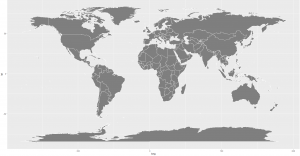
The output of these codes looks close to each other.

Adding the pies
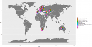
In order to add pies to the map plot, we will add a geom_scatterpie function to our original ggplot formula as illustrated below.
| # Using map_data() | |
| worldmap <- map_data ("world") | |
| mapplot1 <- ggplot(worldmap) + | |
| geom_map(data = worldmap, map = worldmap, aes(x=long, y=lat, map_id=region), col = "white", fill = "gray50") + | |
| geom_scatterpie(aes(x=longitude, y=latitude, group = country, r = multiplier*6), | |
| data = final_data, cols = colnames(final_data[,c(2:11)])) | |
| mapplot1 |

Adding label, chart title, axis title, etc
To improve the appearance of our visualization, we will add a few more accessories to our chart by adding some new functions to our ggplot formula.
| # Using map_data() | |
| worldmap <- map_data ("world") | |
| mapplot1 <- ggplot(worldmap) + | |
| geom_map(data = worldmap, map = worldmap, aes(x=long, y=lat, map_id=region), col = "white", fill = "gray50") + | |
| geom_scatterpie(aes(x=longitude, y=latitude, group = country, r = multiplier*6), | |
| data = final_data, cols = colnames(final_data[,c(2:11)])) + | |
| xlim(-20,60) + ylim(10, 75) + | |
| scale_fill_brewer(palette = "Paired") + | |
| geom_text(aes(x=longitude, y=latitude, group = country, label = country), data = final_data, stat = "identity", | |
| position = position_dodge(width = 0.75), hjust = 1.5, #vjust = -1.5, size = 5, angle = 45, | |
| check_overlap = TRUE, na.rm = FALSE, show.legend = NA, | |
| inherit.aes = TRUE) + | |
| labs(title = "Causes of death by country", x = "Longitude", y = "Latitude") + | |
| theme(legend.position = "top") | |
| mapplot1 |

There you go! We have plotted the distribution of death causes per country in the world map. We can see that almost all of them have the same distribution except Belarus and Georgia which is higher in diseases of the circulatory system relative to the rest of the countries.
The method I’ve shown you above is just one way to do it. Other methods for map plot you could try are ggmap, mapplot, qtm from tmap package, leaflet, etc. I highly encourage you to also give it a try.
A copy of all the files used on this simulation is available at this repository.
——–
Marriane Makahiya, the author, is a data scientist of SpectData. SpectData is a data analytics company founded to help companies make better use of their data.